June 24, 2026
Why mobile-optimized Quick Commerce websites matter in 2026
Discover why businesses need mobile-optimized quick commerce websites and the key features, technology, and infrastructure needed to build one.
Jahnvi Gupta
~t.compress(q:75)/cms_uploads/Why-mobile-optimized-Quick-Commerce-websites-matter-in-2026.webp)
June 24, 2026
Discover why businesses need mobile-optimized quick commerce websites and the key features, technology, and infrastructure needed to build one.
Jahnvi Gupta
Picture this, a customer is on their way home, realizes they have run out of cooking oil, and opens their phone to place an order. Within 30 seconds, they expect to find the product, complete the payment, and see an estimated delivery time. If your website slows them down at any point, the order is highly likely to go elsewhere.
This is the reality of Quick Commerce. It is a business model built around speed, and that speed needs to be reflected in the very first interaction customers have with your brand: your website. Since most customers place orders through their smartphones, a mobile optimized Quick Commerce website has become the need of the hour.
In this blog we discuss what makes Quick Commerce different from e-commerce, why mobile-optimized websites are necessary for Quick Commerce and what a mobile-optimized Quick Commerce should look like.
While traditional e-commerce is built for browsing and buying, Quick Commerce is built for necessity and impulse buying.
Standard e-commerce lets customers take their time; to open multiple tabs, read reviews, compare specs, and leave an item sitting in a digital cart for three days. Quick Commerce operates in an entirely different reality:
The scope: Hyperlocal delivery.
The window: Fulfillment times ranging from 10 minutes to an hour.
The source: Orders are packed and routed from dark stores, local warehouses, or nearby retail outlets.
The goal of the Q-commerce model is singular: deliver the product before the customer has a chance to reconsider the purchase. In other words, when the entire lifecycle of a business structure; from discovery to decision, payment, and fulfillment transpires in minutes, your website cannot act as a static catalog.
Across India and Southeast Asia, the overwhelming majority of standard e-commerce traffic comes from mobile devices. Groceries, meals, medicines, and household essentials are often purchased in response to an immediate need. Customers are not sitting at a desk planning these orders. They happen while commuting, while multitasking at work, or while managing a chaotic household. The user is inherently distracted, operating "on the go," and expecting the software to do the heavy lifting.
Designing for mobile from the start, and building the entire experience around how people use their phones, is what separates Quick Commerce businesses that convert from those that do not. The next question is what that experience actually looks like in practice.
There is a significant difference between a website that simply works on a smartphone and a PWA (Progressive Web Application) website that is specifically built to perform on a smartphone. A truly mobile-optimized Quick Commerce website focuses on several key areas.
Mobile users are not willing to wait. Google found that as mobile page load time increases from 1 second to 3 seconds, the probability of a visitor bouncing increases by 32%. When load time reaches 5 seconds, bounce probability increases by 90%.
Therefore, for a fast-loading PWA website, images should be optimized, unnecessary scripts should be removed, and performance metrics should be monitored continuously. Every second saved improves the likelihood of conversion.
Customers interact with mobile websites using their fingers, not a mouse. That is why buttons, menus, product cards, and search bars need to be easy to tap and navigate.
The navigation should feel natural and important actions should be easy to reach with a thumb. Along with this, the overall layout should be simple enough to use on a small screen without frustration.
Every additional step between the cart and the order confirmation page increases the risk of abandonment.
A mobile-optimized checkout should support saved delivery addresses, one-tap payment options through UPI and digital wallets, and minimal form filling. The goal is to help customers complete their purchase with as little effort as possible.
After placing an order, customers want reassurance that everything is moving as expected.
Therefore, providing live order tracking, accurate delivery estimates, and timely status updates helps build trust while reducing support requests related to delivery status.
Customers should know immediately whether delivery is available in their area. An effective Quick Commerce website identifies the customer's location early in the journey and displays only the products, stores, and delivery options that are actually available. This prevents disappointment later in the checkout process and creates a smoother overall experience.
We discussed what a mobile-optimized Quick Commerce website should look like but a fast and intuitive mobile website is only one part of the equation. Behind every successful Quick Commerce experience is an operational infrastructure capable of fulfilling customer expectations in real time.
If a website promises delivery within 30 minutes but cannot verify inventory availability, route orders correctly, or assign delivery partners automatically, the customer experience quickly breaks down.
The infrastructure supporting a mobile-optimized Quick Commerce business should include:
Integrated order management system that captures and routes orders instantly without manual intervention
Real-time inventory tracking system so customers only see products that are actually available
AI-powered delivery routing system that automatically assigns riders and optimizes delivery paths
Mobile-friendly operational dashboards that allow managers and business owners to monitor activity from anywhere
Platforms such as Fynd Quick Commerce bring these capabilities together by combining a mobile-optimized storefront with integrated order management, warehouse management, AI-powered delivery routing, and zone-based serviceability.
Using Fynd businesses can manage operations from a single platform while maintaining speed and reliability across the customer journey.
The platform supports more than 700 orders per minute with 90% on-time delivery, demonstrating what becomes possible when the customer-facing experience and operational infrastructure work together. Ultimately, all of these capabilities support the promise that defines Quick Commerce: speed.
Quick Commerce promises fast delivery, but before warehouses, inventory systems, or delivery partners come into play, customers need to place an order and that happens on a mobile device.
A mobile-optimized website helps customers find products faster, check out with fewer obstacles, and track orders confidently. It reduces cart abandonment, improves retention, and delivers the seamless experience customers now expect.
With more choices and less patience than ever, mobile experience is not just an optimization, it is a competitive advantage that directly drives growth and operational success.
A mobile-optimized Quick Commerce website is a mobile-first storefront designed for customers who need products delivered within minutes, not days. Unlike a traditional e-commerce website, it is built to help customers discover products, place orders, and track deliveries with minimal effort and as few steps as possible. A well-designed Quick Commerce website includes features such as location-based serviceability checks, fast product search, one-tap checkout with UPI and digital wallets, real-time inventory visibility, and live order tracking.
Mobile optimization doesn't directly speed up deliveries, but it helps customers place orders faster through quick load times, easy navigation, and a seamless checkout experience. Delivery performance depends on your backend systems such as, OMS, WMS, and TMS. That's why the best Quick Commerce platforms combine a high-performance storefront with robust fulfillment infrastructure.
A Quick Commerce website should be designed around speed, convenience, and real-time information. Key features include: Fast page load speeds to reduce bounce rates, location-based serviceability, checks before customers start shopping, prominent search and category navigation for quick product discovery, saved addresses and one-tap checkout experiences, support for UPI, digital wallets, and other popular payment methods and live order tracking with accurate delivery estimates
Yes. Modern Quick Commerce platforms are increasingly designed to support mobile operations for business owners, store managers, and fulfillment teams.

Selling on Myntra, AJIO, Amazon and Flipkart? Learn how to manage catalog, inventory, orders and fulfillment across all marketplaces from a single platform.

Discover how Generative AI is revolutionising virtual try-on experiences across beauty, fashion, jewellery, and furniture and what is driving the next wave of e-commerce personalisation.
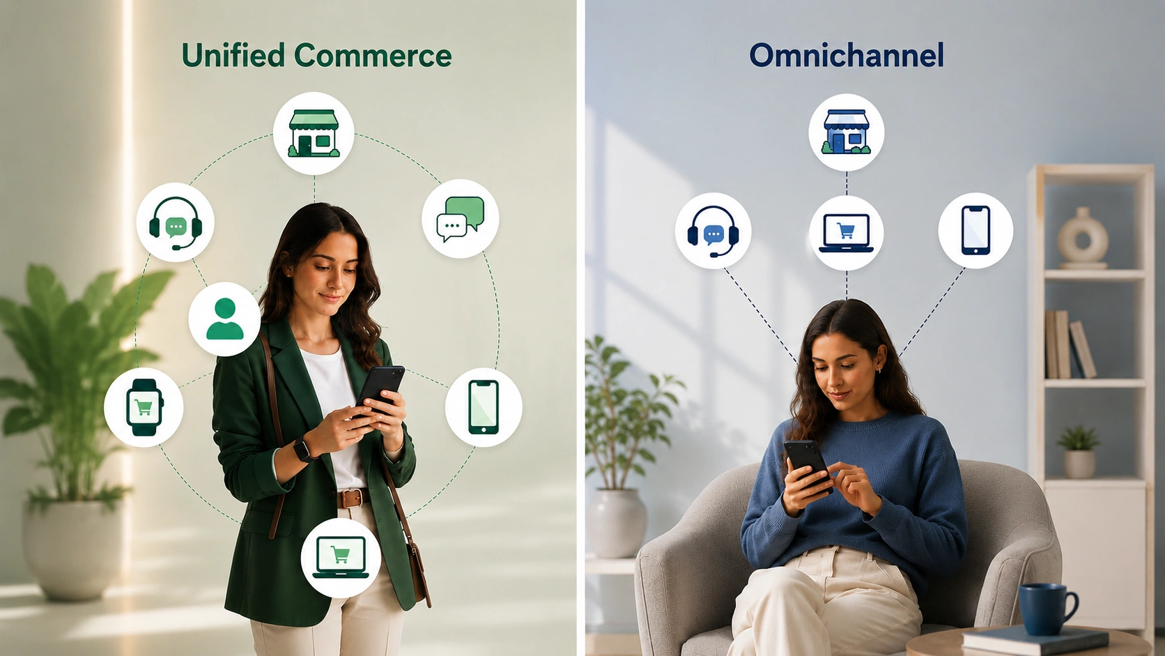
Unified commerce and omnichannel are not the same. Learn the real difference, why it matters in the age of AI and how Fynd helps brands make the shift.
Fill out the form
Share your contact information to get started
Speak to an expert
A member of our sales team will get in touch with you